
Using Charts
Before performing this analysis, you will want to have some data loaded
If we load the data in a MongoDB Atlas cluster, we can use Charts to quickly create visualizations of the data. This section will look at an example chart.
This section of the demo only works with data loaded in a MongoDB Atlas cluster. It is not available when running against other MongoDB instances.
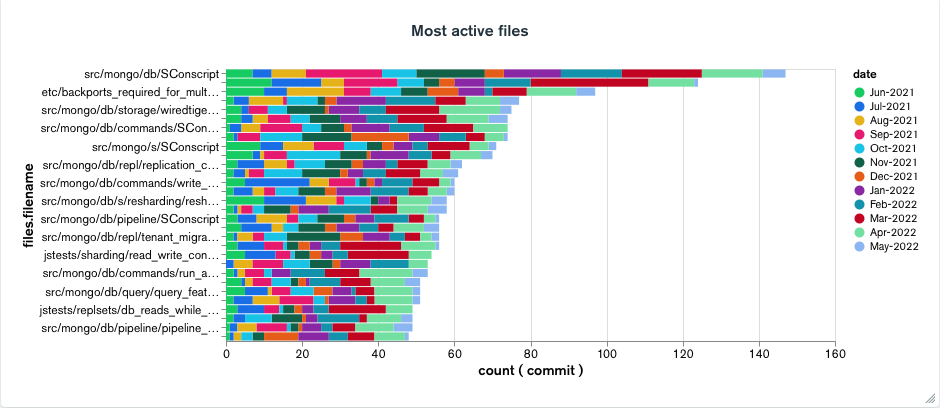
In File ownership part of the demo, we looked at an aggregation that gave us a list of file that have been the most active. We can use Charts to look at this same information visually.
The first step is to launch charts and connect our collection as a data source. We won’t cover that here, so refer to the Chart’s documentation for details.
Once we have the data source hooked up we can create our first chart. Here are the details we want to wire up:
Chart Type: Bar / Stacked
X Axis: commit
    Aggregate: Count
Y Axis: files.filename
    Array Reductions: Unwind Array
    Sort By: Value
    Limit Results: 30
Series: date
    Binning: Month
Once we get everything wired up correctly, we should have a visualization that looks like the following:
That covers all the topics of the demo, but there is a lot more that can be explored.